Creating a Mobile Responsive Application with React and Tailwind.

I am a developer from Nairobi, Kenya with a particular interest in Software Development
Introduction
Since the advent of the World Wide Web, the Desktop has been the channel by which users access the web with 50%, and mobile devices follow closely with 46%. The numbers of mobile devices soar daily as more people use them for specific apps and messaging. As such it is important to take up a responsive design approach to ensure your website is appealing to all your users.
In this tutorial, we shall create an application like Pinterest but specifically for cat images with React. We shall incorporate responsive design for mobile and desktop.
Setting Up
We shall begin with creating a React app as follows in your preferred terminal directory
npx create-react-app catty-app
cd catty-app
We shall use Tailwind for this tutorial, see the following tutorial to learn how to configure it.
The API of choice is The Cat API. We shall use more than 10 images so ensure you create an account and receive your API key and store it for later use.
Creating the Components
The App Component
For routing within the app, we shall use react-router dom,find out how to do it here. In the App component add the header, footer and about components.
import React from "react";
import { Route, Routes } from "react-router-dom";
import Header from "./Header";
import Footer from "./Footer";
import Home from "./Home";
import About from "./About"

function App() {
  return (
    <div className="App">
      <Header />
      <Routes>
        <Route path="/" element={ <Home />} />
        <Route path="/about" element={<About/>} />
      </Routes>
      <Footer />
    </div>
  );
}

export default App;
The Header Component
For the header component, we shall have a nav bar with navigation links to the home and about component.
import React from "react";
import { NavLink } from "react-router-dom"

function Header(){
    return(
        <nav className="hover:text-gray-700 relative px-8 py-4 shadow-lg w-full items-center justify-between flex flex-wrap">
            <h1 className="text-4xl font-montserrat font-bold text-yellow-400 text-left">Catty</h1>
            <div className="space-x-4 text-2xl font-montserrat text-yellow-400">
            <NavLink to="/">Home</NavLink>
            <NavLink to="/about">About</NavLink>
            </div>

        </nav>
    );
}


export default Header;
The component should look like this:

The About Component
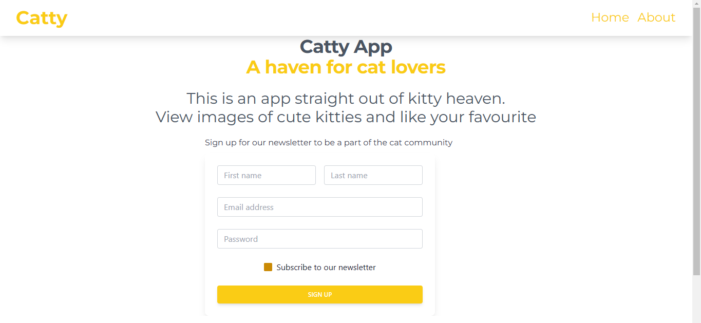
The about component is to let users know what the application is about and consider signing up for a newsletter.
import React from "react";


function About(){
    return(
        <div>
            <h1 className="text-4xl font-montserrat text-center md:text-6xl xl:text-7xl text-gray-600 font-bold tracking-tight mb-6">Catty App <br /><span className="text-yellow-400">A haven for cat lovers</span></h1>
                <h2 className="mb-5 text-3xl text-center font-montserrat text-gray-600">This is an app straight out of kitty heaven. <br/> View images of cute kitties and like your favourite</h2>
            <div className="mx-80">


                <p className="ml-20 text-gray-700 font-montserrat">Sign up for our newsletter to be a part of the cat community</p>
            <div class=" block ml-20 mt-2 p-6 rounded-lg shadow-lg bg-white max-w-md">
                <form >
                    <div class="grid grid-cols-2 gap-4">
                    <div class="form-group mb-6">
                        <input type="text" class="form-control
                        block
                        w-full
                        px-3
                        py-1.5
                        text-base
                        font-normal
                        text-gray-700
                        bg-white bg-clip-padding
                        border border-solid border-gray-300
                        rounded
                        transition
                        ease-in-out
                        m-0
                        focus:text-gray-700 focus:bg-white focus:border-yellow-600 focus:outline-none" id="exampleInput123"
                        aria-describedby="emailHelp123" placeholder="First name">
                        </input>
                    </div>
                    <div class="form-group mb-6">
                        <input type="text" class="form-control
                        block
                        w-full
                        px-3
                        py-1.5
                        text-base
                        font-normal
                        text-gray-700
                        bg-white bg-clip-padding
                        border border-solid border-gray-300
                        rounded
                        transition
                        ease-in-out
                        m-0
                        focus:text-gray-700 focus:bg-white focus:border-yellow-600 focus:outline-none" id="exampleInput124"
                        aria-describedby="emailHelp124" placeholder="Last name">
                        </input>
                    </div>
                    </div>
                    <div class="form-group mb-6">
                    <input type="email" class="form-control block
                        w-full
                        px-3
                        py-1.5
                        text-base
                        font-normal
                        text-gray-700
                        bg-white bg-clip-padding
                        border border-solid border-gray-300
                        rounded
                        transition
                        ease-in-out
                        m-0
                        focus:text-gray-700 focus:bg-white focus:border-yellow-600 focus:outline-none" id="exampleInput125"
                        placeholder="Email address">
                        </input>
                    </div>
                    <div class="form-group mb-6">
                    <input type="password" class="form-control block
                        w-full
                        px-3
                        py-1.5
                        text-base
                        font-normal
                        text-gray-700
                        bg-white bg-clip-padding
                        border border-solid border-gray-300
                        rounded
                        transition
                        ease-in-out
                        m-0
                        focus:text-gray-700 focus:bg-white focus:border-yellow-600 focus:outline-none" id="exampleInput126"
                        placeholder="Password">
                        </input>
                    </div>
                    <div class="form-group form-check text-align: text-center mb-6">
                    <input type="checkbox"
                        class="form-check-input appearance-none h-4 w-4 border border-gray-300 rounded-sm bg-white checked:bg-yellow-600 checked:border-yellow-600 focus:outline-none transition duration-200 mt-1 align-top bg-no-repeat bg-center bg-contain mr-2 cursor-pointer"
                        id="exampleCheck25" checked>
                        </input>
                    <label class="form-check-label inline-block text-gray-800" for="exampleCheck25">Subscribe to our newsletter</label>
                    </div>
                    <button type="submit" class="
                    w-full
                    px-6
                    py-2.5
                    bg-yellow-400
                    text-white
                    font-medium
                    text-xs
                    leading-tight
                    uppercase
                    rounded
                    shadow-md
                    hover:bg-yellow-700 hover:shadow-lg
                    focus:bg-yellow-700 focus:shadow-lg focus:outline-none focus:ring-0
                    active:bg-yellow-800 active:shadow-lg
                    transition
                    duration-150
                    ease-in-out">Sign up</button>
                </form>
                </div>
            </div>
        </div>
    );
}


export default About;
The component should look like this:
The Footer Component
The footer component is to let users know the API which powers the app. You can add your name to let users know you created the app.
import React from "react";

function Footer(){
return (
    <div>
        <div className="bg-white text-align:text-center lg:text-left">
        <div className="text-yellow-400 font-montserrat text-center p-4" >
                    Powered by
                <a className="font-montserrat text-yellow-400" href ="https://thecatapi.com/"> The Cat API</a>
            </div>
            <div className="text-yellow-400 font-montserrat text-center p-4" >
                     Created by  <a className="text-yellow-400" text-center href="https://www.linkedin.com/in/roseland-ambuku/"> Roseland Andisi Ambuku</a>

            </div>
            <div className="font-montserrat text-yellow-400 text-center p-4" >
                     © 2022 All Rights Reserved
            </div>
        </div>
    </div>
);
}

export default Footer;
The component should look like this:

The Home Component
The home component is where we shall have the cats component.
import React from "react";
import Cats from "./Cats"

function Home(){
    return(
        <div className="p-5">
           <Cats />
        </div>
    );
}

export default Home;
The Cats Component
In this component, we shall fetch the cat pictures from the Cats API using axios. Axios is a hhtp client which is promise based.
To use axios install the library as so
$ npm install axios
Then import the library as so to the component where it will be used.
import axios from 'axios';
The useState hook shall manage the state that is the cats that come from the API.The useEffect hook to fetch the data from the API along with axios.
import React, { useState, useEffect } from 'react';
import axios from 'axios';

const Cats = () => {
  const [cats, setCats] = useState([]);
  useEffect(() => {
    axios
      .get('https://api.thecatapi.com/v1/images/search?limit=35&api_key=live_2iTYDHO3IIltr8nHV8DS3ERMdf6MaOD69XmHNtfw5GINuX5lXoHdJBBKzgXbR6lP')
      .then((response) => setCats(response.data))
      .catch((error) => console.log(error));
  }, []);

  return (

    <div className= "max-w-7xl laptop:columns-5 mx-auto space-y-4">
      {cats.map((cat) => (
        <div key={cat.id} className="overflow-hidden bg-gray-300 rounded-md">
          <img  src={cat.url} alt="cat" />
        </div>
      ))}
    </div>
  );
};

export default Cats;
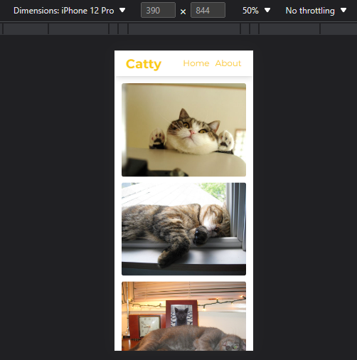
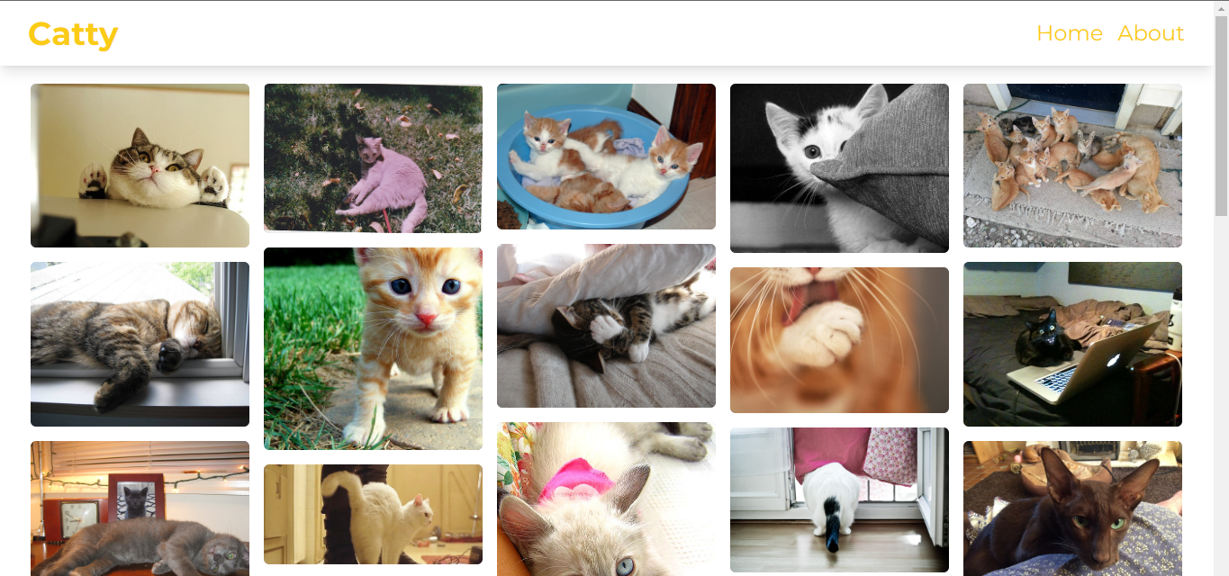
To implement the mobile responsiveness, check the tailwind.config.js for the dimension for the screens. Use the laptop breakpoint to set 5 columns which is good for the laptop. The breakpoint will only apply to large screens like laptops. For smartphones it shall be one column which is good for smaller screens.
This is how it shall look on a mobile screen.
This is how it shall look on a desktop screen
Conclusion
Taking up a responsive design will help attract more users who prefer to use their mobile phones and also keep those who use their laptop. The link tot he repository for the project is here.
That is all for now. Untill next time, may the code be with you.